

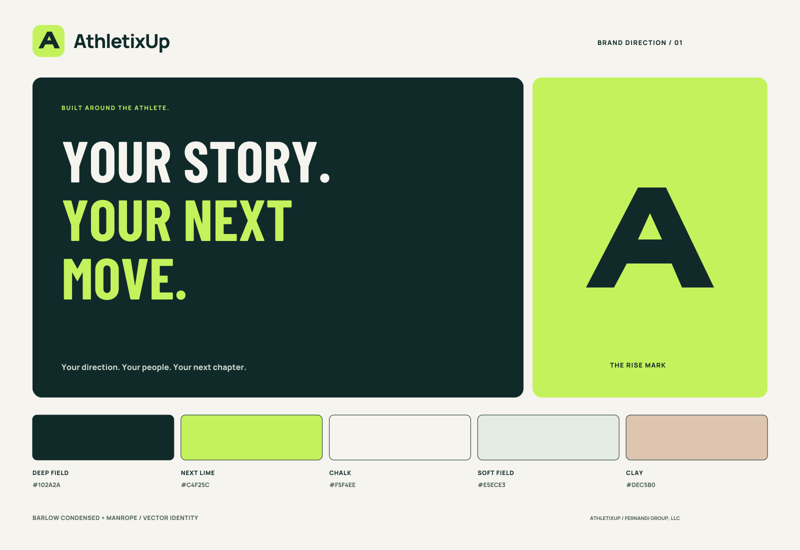


Deep field
#102A2APrimary ink, navigation and dark surfaces
ATHLETIXUP / BRAND DIRECTION 01
A confident, athlete-centered identity. Forward-looking and clear, with enough warmth for the people in your corner.
01 / IDENTITY
An angular A built from upward strokes and a shared crossbar. A compact symbol for direction, effort and support.
Keep clear space around the logo equal to one-quarter of the mark. Use the mark at 24px or larger and the full lockup at 140px or larger. Preserve the proportions and use solid colors.
02 / PALETTE
Deep field carries the identity. Lime marks the next action. Chalk and soft field keep the experience calm and readable.
#102A2APrimary ink, navigation and dark surfaces
#C4F25CAction, momentum and the Rise mark
#F5F4EEWarm page backgrounds and breathing room
#E5ECE3Quiet panels and supporting surfaces
#DEC5B0Occasional warmth in editorial graphics
Use deep-field text on lime. Reserve lime for action and emphasis; use ink or white surfaces for longer reading.
03 / TYPOGRAPHY
FOR WHAT
COMES NEXT.
Bring the details together. Explore your options. Take the next useful step with people you trust.
Aa Bb Cc Dd Ee Ff Gg Hh
0123456789 / ↗
Use condensed type for short, expressive headlines. Use Manrope for navigation, forms and body copy. Both fonts are self-hosted with their SIL Open Font Licenses included in the repository.
04 / VOICE & PRODUCT
Write like a thoughtful teammate: direct, useful and encouraging. Put the athlete in charge. Explain the next action and preserve what is unknown.
“Start with one program you want to understand better.”
“Your source is saved. Review the fact before using it.”
“You’re in. Let’s make your next move.”
Make time for one useful action today.
Make your next move ↗